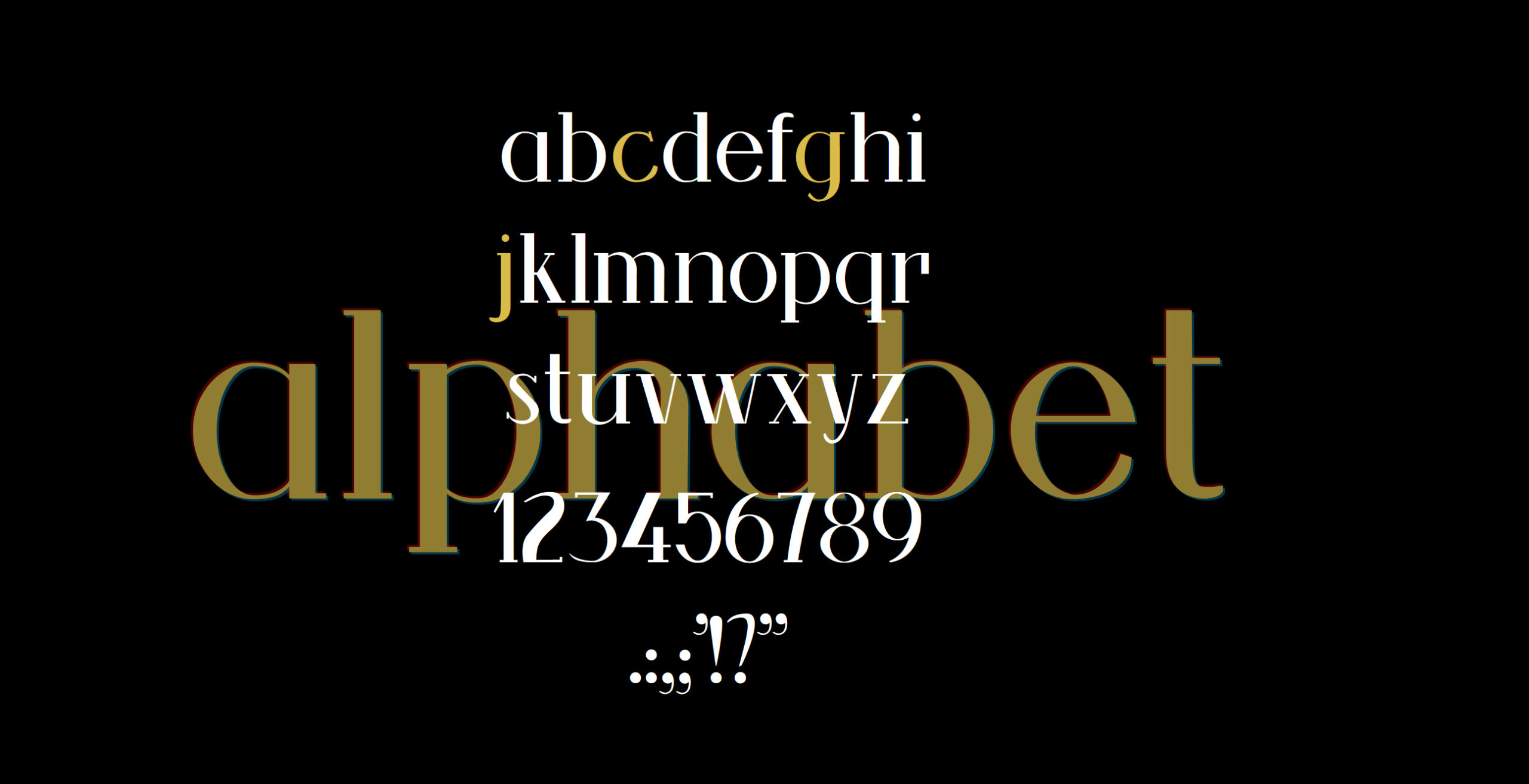
This typeface started in the Spring of 2020 with the capital letters and was finished that Fall with the lowercase, numbers, and symbols. I also built the landing page that semester along with the advertisement on the right. This was really fun to put together as I took a modern Sans-Serif aesthetic and made it a Slab-Serif. There’s a lot of elements you don’t see in Serif typefaces with it, and it has an art deco appeal in some ways which is why I was inspired to do the page with the gold along with the ad for it. It turned out better than expected and is nice to hand down to my son to use in his lifetime.